Important aspects of the brochure:
- The brochure can be designed as a bi-fold, tri-fold, leaflet, and it can go up to any number of pages depending on the content of information that needs to be showcased.
- It can be designed in many shapes and sizes of the paper such as A4, A3, and many other customizable sizes depending on the design proposition and creative features that need to be highlighted.
- It is one of the most crucial marketing materials used at various events, exhibitions, and project launches and always comes at the topmost priority of the marketing department of any company.
- The heavy brochures are usually handed over to the customers explaining in-depth details about the brand extending the personal touch and leaflets, bi-folds, and tri-folds are distributed at the high traffic areas to masses. However, it all depends on the merit of the case.
- With the onset of digitization, e-brochures also play an important role along with the hard copy of the brochures. E-brochures are easy to e-mail, view and navigate on any tablet, mobile device or computer screen and hence, it is important to keep this aspect in mind whilst designing the brochure.
Best Tips for Brochure Design:
Even though designing a brochure sound quite easy but it can actually be quite tricky and a mammoth task for the marketing department as it is quite a layered concept involving approvals from various hierarchy levels, brainstorming sessions, coordination with the advertising agency, and considering each and every minute intricacy at every level of designing a good brochure.
Below mentioned are the Best Tips for Brochure Design:
1) Understand the Objective
It all needs to start from the scratch by figuring out the goal and the underlining objective of designing the brochure. Various questions such as what should be the theme of the brochure, what is the budget, which advertising agencies should be hired for the pitch, what all brand, project, product or service details needs be showcased, where will the brochure be used and for what purpose need to be answered internally amongst the think-tank team of the company.
Once the objectives are clear and strategic in nature then only the way ahead of the designing process will be smoother.
2) Know the Customer
This is one of the most important Tips for Brochure Design as the customer always takes the center stage of every marketing and sales procedure with every activity revolving around him. The marketing department needs to filter down the target market and figure out who is their real customer and design the brochure in accordance with his taste and requirement.
If the target audience belongs to the category of Sec A and A+ then the brochure design needs to be more classy and niche and if the target audience belongs to the mid-segment category, then the brochure design will be quite indifferent from the above mentioned.
This tip is also interlinked with the product and service type offered by the company as it leads the way for segregation of target market and audience.
3) Research and Study
It is always necessary for a good marketer to have a thorough competitive analysis and of the latest design and printing trends ruling the market whilst designing the brochure to gain the edge over the contemporaries.
4) Be Unique and Innovative
There are ample of brochures being churned out in the market by the various advertising professionals but there are very few that strike the right chord with the audience. Hence, it is very important to be uniquely creative and innovative in the brochure designing process. Have brainstorming sessions within the team and convey the brochure ideas and concepts shortlisted to the advertising agency so that they can also come up with novel and vibrant ideas depending on the brief.
5) Use of Actual and Stock Imagery
One of the Best Tips for Brochure Designing is to consider that the entire look and feel of the brochure get elevated if there is a right usage of imagery placed in an aesthetic manner. Actual images of the project, products or services of the company highlighting the nature of business always add the much-required value and trust in the mind of the customer. Also, stock imagery can be used as the supporting factor showcasing the details about the brand and its products or services.
6) Content is the king
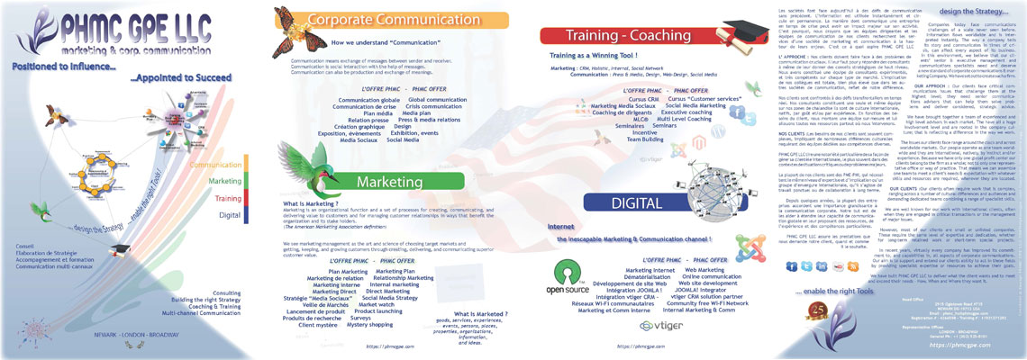
Neglecting the flow and quality of the content is the most common mistake that marketers do whilst designing a brochure. Content is always the king as the real buyer will always be keen to read about your company philosophies, product details, and all the related features whilst deciding on to invest his money with your brand. Hence, having a great copy is one of the Best Tips for Brochure Designing plus it creates a good impression of the brand.
Content and imagery used should always complement and influence each other that results in the great flow of the entire brochure. The main points and details need to be showcased in the initial pages and the rest of the details needs to be followed.
7) Breathing Space
The brochure should not be filled with copy and images but there should a fine ratio between the both resulting in the breathing space to maintain the design aesthetics and an ease to the eye of the reader.
8) Call to Action
This point holds a significant place in the list of Best Tips for Brochure Designing as the call to action details such as company name, address, email address, website, contact details, and any other such vital details are a must to generate the potential leads and prospective database.
9) Proof Read and Grammar Check
It is a must to proofread the copy, run the grammar check, check the use of imagery couple of times, and run a test print of the entire document to curate a good brochure.
10) Printing quality
Quality of the paper used depending on the budget and if the brochure needs to saddle stitch or hardbound are some of the printing specifications that need to be on the checklist before giving the file for printing. No matter how well the brochure looks on the computer screen, if the printing quality has errors, is not up to the mark or the specifications does not complement the brochure design; the entire hard work is wasted because of overlooking this essential point that holds a prominent place in the Best Tips for Brochure Designing.
Sources: HO1.us - Marketing91 - Coffee Break

